Increasing Access Through
Strategic UX Design
Website Redesign | Content Strategy | Visual Design and Branding
THE SCOPE
Fertiquity is a disruptive “insuretech” startup determined to change the insurance landscape by providing supplemental infertility treatment coverage.
They came to General Assembly seeking help with their pre-launch website. They asked for a website redesign that would introduce their product, allow users to calculate their insurance rate, and increase engagement.
- 2 week rapid design sprint
- 2 UX designers
- 1 clickable prototype
- Recommended next steps
DISCOVERY
What does our target audience know about infertility treatment and insurance options?
Of users who said they would consider having kids one day, almost all said they would consider supplemental fertility insurance if it fit their budget.
Their largest concerns: not knowing what it is, how much it would cost, or what it would cover.
- 1 survey, 48 respondants
-
17 in person street interviews

DISCOVERY
How does the current site help users reach their goals?
Is it effective in meeting Fertiquity’s goals?
Participants were likely to click off of the current site due to a lack of informative content about Fertiquity, infertility, and insurance models.
Global navigation was misleading and kept our participants clicking aimlessly with lasting confusion when prompted to find more information about plans, learn about the company, and sign up to be notified for launch.
- 5 rounds of usability testing (former site)
OUR USERS
- Intimidated and avoidant
- Proactive but misinformed
- Aware but unprepared
OUR SITE GOAL
Empower users to make educated planning decisions about their future and demistify Fertiquity’s insurance product through strategically-placed content and an intuitive interface.


PROTOTYPING & TESTING
Based on our research into best practices for introducing new or disruptive information, we decided to test a scrolling homepage with curated content blocks based on frequently asked questions from our survey and interviews.
We tested our first paper prototype by asking participants what questions they had and what they expected to see after each content block and we were able to refine the most effective flow of information on the scroll.
- Secondary research into best practices
- Paper prototype of home scroll
- 5 rounds of usability testing


ITERATION
We took our refined content order and built out the homepage in higher fidelity clickable wireframes. Insights we implemented based on previous testing are listed in green above.
This round, we primarily tested button placement and copy to see how effective each were when prompting users with various tasks. In red above are usability pain points our users still had.
Additionally, building in Figma allowed us to test and validate the actual scroll functionality. Each of our participants immediately scrolled upon landing, validating our initial design.
- Wireframes of home scroll, made in Figma
- 5 rounds of usability testing

VISUAL DESIGN & BRANDING
In order to effectively communicate complex information about fertility and insurace, we needed the website to be simple, clean, and modern. With this in mind, we created a style guide for the client based on the target user preferences and brands she liked.
We chose a basic gender neutral palette to ensure we effectively communicated that Fertiquity is intended for all identities. Green to represent fertility and blue to increase calmness and trust. We chose a contrasting orange to designate important copy and draw attention to engagement buttons.
- Mood board
- Style guide
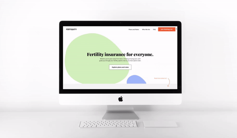
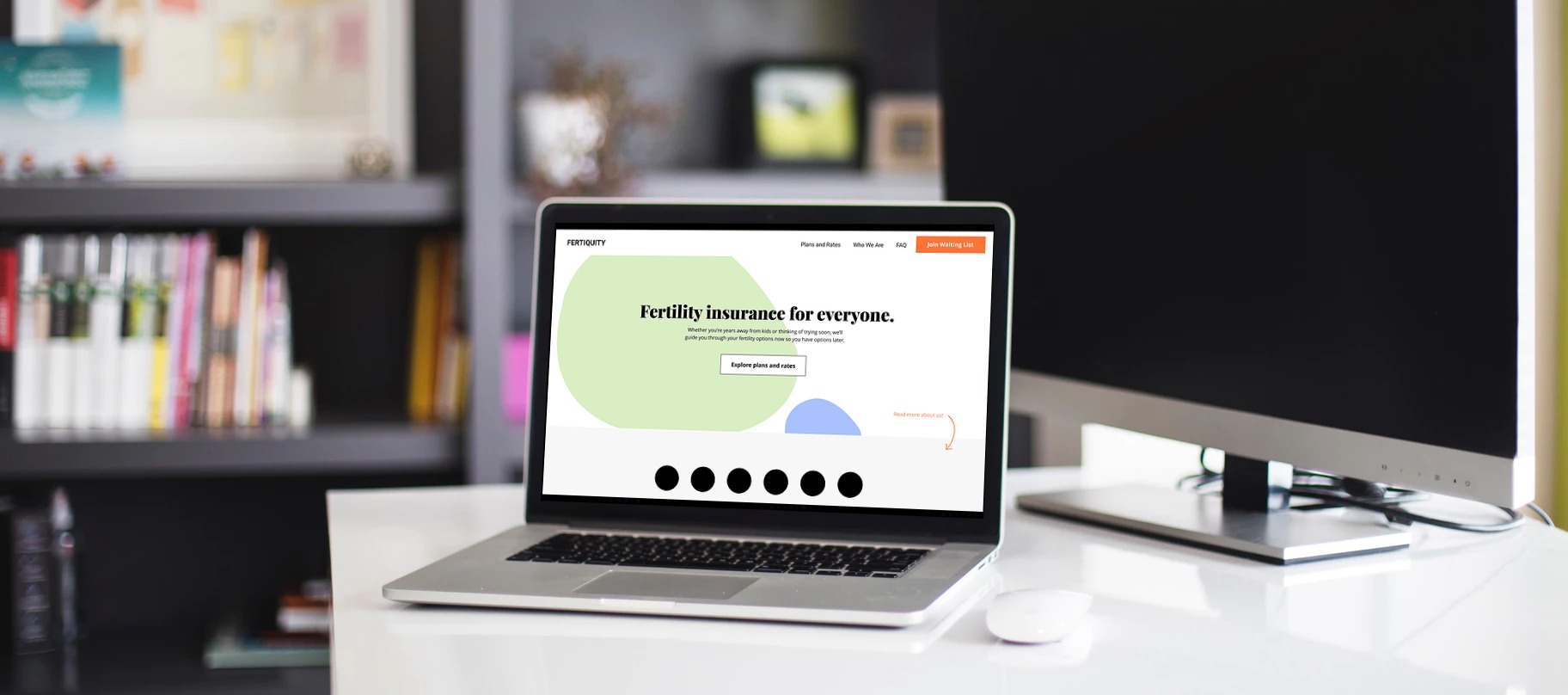
THE CLICKABLE PROTOTYPE
We created a scrolling homepage that works to steward users through their initial questions and direct them throughout the site. Our final products answers the questions about fertility, Fertiquity, and insurance models that we compiled from both interviews and testing to best equip our users with the knowledge they need to make the right decision for themselves.
One of the biggest changes we made from testing to clickable prototype was button placement. Even though our participants found all the content blocks informative, the number one question people had still was about rates.
We took out the rest of the redirects, leaving those options in the sticky navigation (in line with scrolling best practices) for them to access when they wanted, but placed a large contrasting button for them to check their rates at the content block where they most commonly asked about pricing.
We also drew attention to the ability to sign up for Fertiquity updates by clarifying the copy of the CTA button, highlighting it in the same contrasting color, and placing it in the ever-present sticky navigation bar.
- Clickable mockup in Figma
And this is what Fertiquity had to say about the project:
“They exceeded my expectations! LOVED, LOVED, LOVED. It was a magical experience…Given the timeframe, I expected a very light and general touch, but they were thorough. Understanding the intended user is critical. I am bootstrapping a business that has the audacity to take on the insurance and healthcare industry. This project not only helped me get much closer to making this vision into a reality, but it provided a roadmap that a non-technical founder could understand.”